Nudges on planes, trains & lifts
There are lots of small adaptations in design that influence our behaviour and the decisions we make. These are called nudges in behavioural science – many of them are small, subtle or unnoticed but they can help reduce the cognitive load and improve our experiences, or our perception of the experience.
Harry Beck and a map
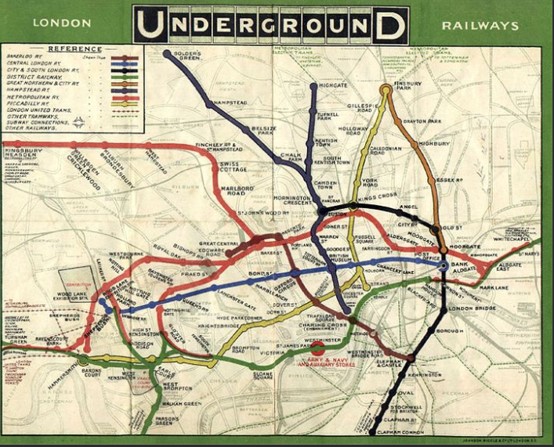
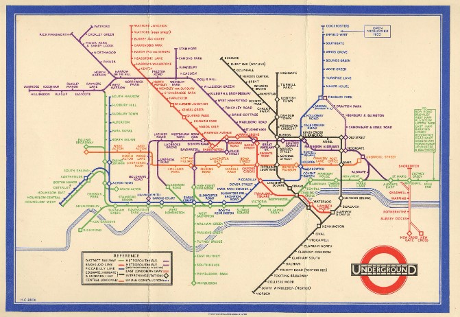
In 1933 Harry Beck re-designed the tube map. Rather than the maps that resembled to the actual geography of the city his simplified the information, and changed how we use the tubes, and even how we see the city of London.
On the left a tube map from the late 1920s and on the right 1933 Harry Beck redesign.
Why is it so effective? What can we learn from the Beck map?
- Test & learn – testing with behavioural science interventions is crucial to understand what works in the real world. Only 500 copies of Harry Beck’s 1933 new design were printed as they weren’t sure it would work. However, it was such a success that it has remained the model of all London underground maps and frequently copied by other cities.
- Info-lite – to reduce the cognitive load this only show tube lines. It does not include South London rail networks which would help people navigate better around South London. The choices we make about the information to include are important. By reducing the amount of information on the map, the cognitive load is reduced meaning our lazy but energy consuming brains find it easier to process and plan. By adding too much information we make it harder and more effortful to process.
- Perception – we perceive vertical and horizontal journeys as quicker and faster. Subconsciously people add travel time cost onto diagonal or angular journeys. Maybe why the Central Line is always so busy – it is straight line through the middle?
- Our brains are lazy and don’t want to use up energy thinking when they don’t have to. Equal spacing of the stations changes the question from ‘how far’ to the easier question of ‘how many stops?’ This is a much easier question to process.
How, and where else, can we see subtle and helpful nudges that make our journeys more friction free and enjoyable?
To paraphrase the Wombles ‘Underground, overground, its time to see how nudges shape behaviour creatively‘
Here are a few (of thousands) of nudges working on different transport networks:
1. Placebo buttons & the illusion of control
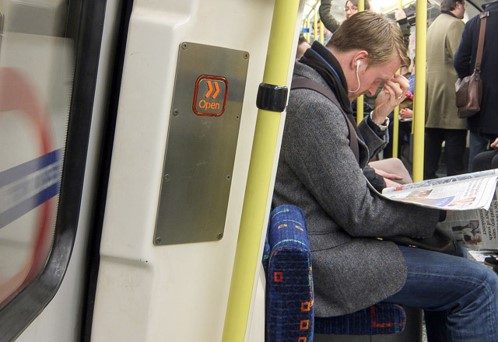
Although removed in recent refurbishment, the buttons on the tube to open the doors haven’t worked for decades. Buttons like this (and at traffic lights) give us an illusion of control over when the doors open or the lift arrives. (The buttons used to work until the 90s when drivers took over the controls but the buttons remained to reassure passengers). As humans we want control and pressing the button gives us that sense of autonomy even if doesn’t open the door.
2. Reducing cognitive load with colours
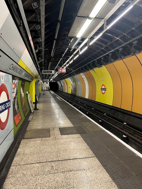
Introduced in the 90s on the Jubilee line first extension to Charing Cross, the yellow ‘way out’ panels – on the left the strips of yellow above the way out door and the elongated yellow strips to guide you as well. The yellow for the way out is mirrored on the right with the big yellow panels to visually help make your journey easier and clearer.
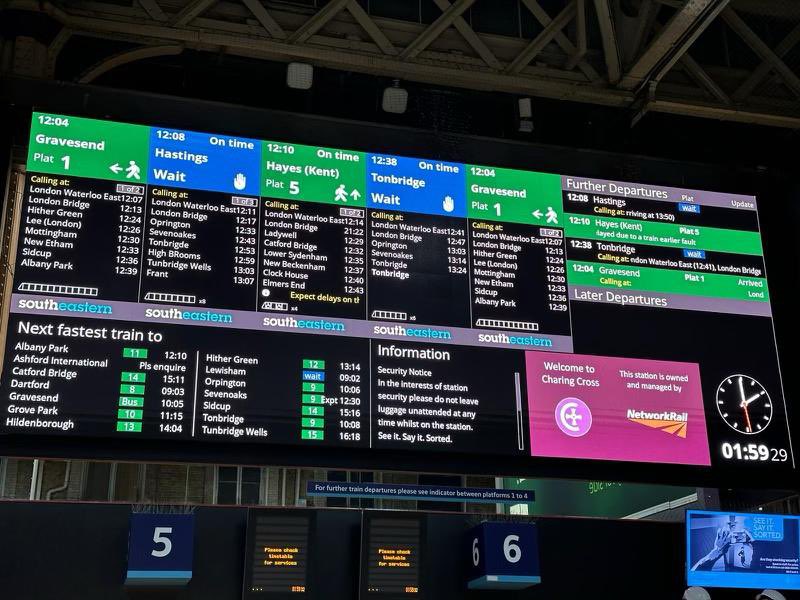
In 2021 and 2022 easier to read new behaviourally informed signage at London Waterloo and London Charing Cross.
- Green as the universal signal for ‘go’ with a walking person and directional arrows. Again this reduces the cognitive load as we are subconsciously programmed to know that green means go.
- A hand held up as a universal sign for wait/ stop. Blue colour – not universally recognised as wait – would amber have been better?
Colours are very powerful visual clues that catch our attention and inform our behaviour. Red and stop is used universally to signal stop or danger and draws the eye. Around Halloween orange coloured products (whether Halloween related or not) increase dramatically in sales – the colour orange for Halloween is more salient at that time of year.
3. Filling unoccupied time to speed up our internal brain clocks
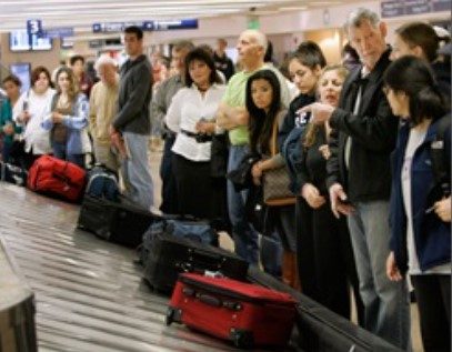
And an example from the airlines.
After multiple complaints about baggage wait times at Houston airport – they investigated and introduced a simple fix.
Passengers were walking for one minute, then waiting for 7 minutes to claim their bags.
Unoccupied time causes our internal brain clock to slow down (people routinely overestimate the amount of time they’ve spent in line by 36%).
Standing and watching an empty carousel with no luggage is therefore really frustrating and feels like it is taking a very long time.
When we are occupied we feel time is moving faster. When we are moving we feel we are more in control of what is happening.
By re-routing passengers through the airport, they made the walk to baggage claim six times longer (a six minute walk) creating more occupied time. Passengers then only had to wait two minutes for the bags to arrive (reducing the idle wait. This solution convinced passengers’ brains that time was moving quickly and complaints disappeared.
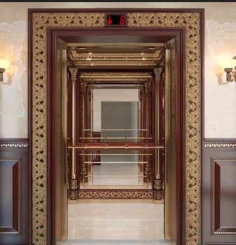
Filling unoccupied and waiting time is why mirrors were introduced to lifts in the early twentieth century when they were a relatively new invention and travelled slowly. Mirrors and checking your appearance provided a way to occupy the journey time.
4. Create new social norms – show don’t tell
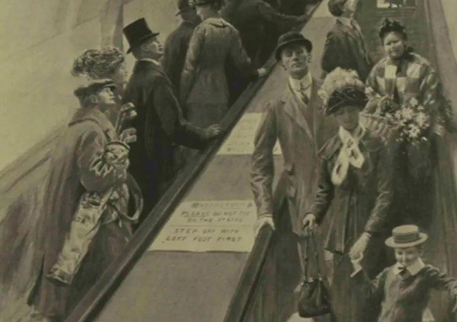
Escalators were introduced to the underground in 1911 but treated with suspicion.
One legged engineer William ‘Bumper’ Harris was employed at Earl’s Court station to ride up and down the escalator. We take our cues from the social behaviours of others around us and mimic it – Bumper Harris demonstrating how easy and enjoyable the moving escalator was reassured passengers. If a one legged man could easily and successfully navigate this moving staircase they could do.
5. Give clues about what you want them to do
What could we learn from these nudges?
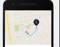
- Test it and see if it works Decision science needs testing in real life situations – as anthropologist Margaret Mead said “What people say, what people do, and what they say they do are entirely different things.” Can you test out a new campaign with a small group to see if it works? Uber do 12,000 tiny tests a year on their App – changing the bevel on the little car to improve the experiences for users and drivers. Test and learn.
- Less is more – what can you take out to make it easier for people to understand. You don’t have to include everything. We have a tendency to want to tell everyone everything we know – rather than the most useful and relevant parts. Reduce the information to make it easier to process.
- Colours have a powerful effect and give people clues about what you want them to do – red for stop, or green for go. How can colours guide supporters and show them what you want them to do? Should your call to action button be green giving them the ‘go ahead’ to donate or red to draw attention because its important? or are brand colours more effective with your supporters? Test what works.
- Autonomy – we feel better if we feel in control of the situation (whether pressing the button works or not) how can we give supporters autonomy over their choices?
- How to occupy unoccupied time? When waiting in a queue online or in real life how can you make the waiting screen enjoyable with animation, or can you introduce, like Disney, cast actors who are interacting so that your unoccupied time becomes part of the experience?
References
‘Transport for Humans’ Rory Sutherland and Peter Dixon
‘Evolutionary Ideas’ Rory Sutherland
Tour of Hidden London | London Transport Museum (ltmuseum.co.uk)
Why Do Elevators Have Mirrors? » Science ABC
There is no ‘rule of six’ – the truth about the science of queueing | UK news | The Guardian
The issue at Houston Airport — Occupied time & design. | by Bradley Gabr-Ryn | Caus | Medium
When the London Underground first got escalators people were too scared to use them – MyLondon




Leave a Reply
Want to join the discussion?Feel free to contribute!